Greenburgh Library Website Redesign
This project is volunteer UX work that I’ve done for the Greenburgh Public Library.
Why this project? I’ve been a longtime enjoyer of the library. I noticed that their website was difficult to navigate, and wanted to give back.
Mentored by Lorenzo Dolfi.
Role: UX Researcher, UX/Ui Designer.
Timeline: 4 Weeks - currently working with developer.
Team: Cristina Ryan Linder - Library Director, Andrew - Head developer, Christa O'Sullivan - Management.
I greatly improved the website → User’s task completion time went from 18 min to just 3 min.
I tested users on how well they completed tasks that were reported as most difficult + prominent on the website.
How did I do it?
SURVEY
1. First, I surveyed library staff.
Method: I sent out a survey with questions about the user experience to the library staff of GPL.
Why: Library staff has helped thousands of visitors with navigating their website. They know what the most common issues are.
Results: The top issue was that it’s hard for users to find things due to information overload. More specifically:
Difficult to renew books.
Difficult to find Museum Pass page.
Difficult to find Events page.
Difficult to view on mobile screen. Not responsive.
The survey helped me decide on 4 tasks to test with users in the next step.
2. Next, I tested the original site.
USER TESTING
Method: Asked 6 participants to complete 4 tasks on the original website & had them think-out-loud.
Why: To discover where all of the common pain points are in detail.
Results: Users took 20 min on average to complete all tasks.
Museum Pass task: Av of 8 mistakes.
Renewing book task: Av of 7 mistakes.
Finding a DVD task: Av of 3 mistakes.
French Convo Group event task: Av of 2 mistakes.
This helped me prioritize certain issues over others.
Example of test analysis. I listed every step they took and then marked if they were correct or incorrect steps. It is apparent that this participant struggled with finding the Museum Pass page.
3. I studied how other library websites were built.
COMPETITIVE ANALYSIS
Method: I studied the pro’s and con’s of all local library websites.
Why: To understand the industry standard, what others are doing well, and where we can provide better services.
Results: The Greenwich Library website was able to provide great inspiration because it had pleasant ui design, great organization of content, live assistance, and a conventional navigation page.
DEFINING
4. I listed the main problems.
Users had difficulty finding what they were looking for.
More specifically:
Navigation Menu: hard to navigate.
Search bar: unclear functionality.
Home page: not standardized.
Museum Pass page: too much information.
5. I created User Personas.
USER PERSONAS
Method: I created three personas, each representing different issues discovered in research.
Why: User personas are great tools to remember our main goals: that we are designing products for people and their specific needs.
Results: Lemonia represents users who want to access resources such as the Museum Pass and printer. Frank represents users who want to access educational resources. Lauren represents older users who have lower tech literacy who wants to attend events.
5. I ideated & prototyped solutions
IDEATION & PROTOTYING
Specific Problems:
There are too many categories which makes users feel overwhelmed & lost.
The names of the categories are unclear to some users.
Problem #1: Navigation Menu is hard to navigate.
Solutions:
Have less categories by relocating, combining, or deleting them.
Ask users what name would be more intuitive for them.
Next, how do I combine & reorganize the categories so it’s more intuitive?
1. I first laid out all 60+ pages on the site in order to understand its contents.
2. Then, I moved each content to similar categories.
3. Lastly, now that there are clear groups, I can start creating the wireframes of the navigation menu.
Before
After
Problem #2: Unclear functionality of Search Bar.
Users didn’t notice that they can click “Online Catalog” and choose to search the website instead of only the catalog.
Solution: Make it more clear by displaying both options at all times.
Too much text and contents were not prioritized well.
Solution: Make it more welcoming & include only highlighted information.
Problem #3: Home page is not standardized.
Before
After
Problem #4: Museum Pass page has too much information.
Solution: Have more clear hierarchy, clear photos, and summarized information.
Before
After
6. I presented my designs to the Library Director & got feedback.
FEEDBACK
Christina Ryan-Linder, Director at Greenburgh Public Library
Why: It is just as important to consider the stakeholders needs as user’s needs.
Results:
Take out “Free” in title “Free Museum Pass” because it’s technically paid by taxpayers and patriots.
Would like a “Join Mailing List” section on Home page.
Liked the change of category name from “Calendar” to “Upcoming Events”.
USER TESTING
7. I tested my design.
Method: I gathered the same participants from the first test and gave them the same tasks to complete on the new design.
Why: So I can see if the task completion times has improved.
Results: Times improved drastically:
Participant 1: 18 min → 2 min!
Participant 2: 23 min → 2.5 min!
Participant 3: 17 min → 3 min!
Participant 4: 15 min → 1 min!
Participant 5: 25 min → 2 min!
Participant 6: 19 min → 1 min!
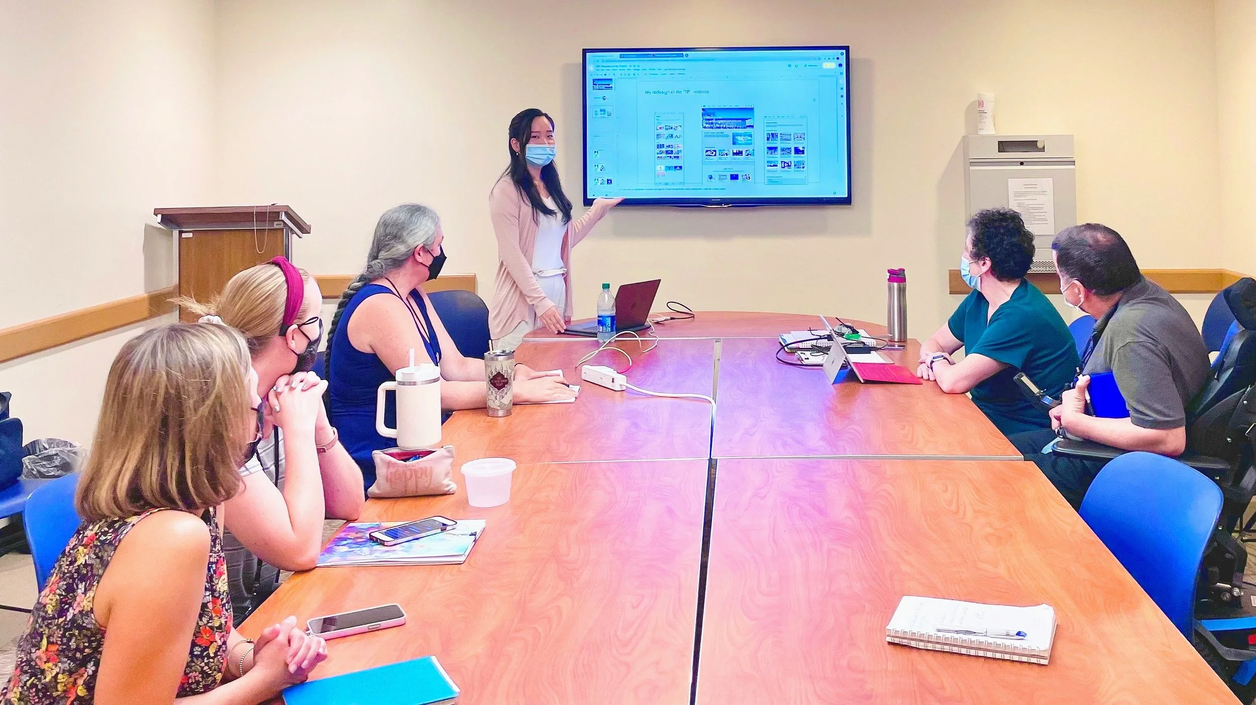
8. I presented to my stakeholders & recieved feedback.
PRESENTATION
They were very pleased with my findings and solutions and wanted to implement them as soon as possible.
RESULTS
Myself presenting my UX work to the library board.Continue to work with developers at Greenburgh Public Library & gradually incorporate my designs.
Implement feedback that I’ve received from the presentation.
Add a “Renew” category under “Services” category since some testers checked there first, instead of clicking the top right icon.
NEXT STEPS
Check out my next project:
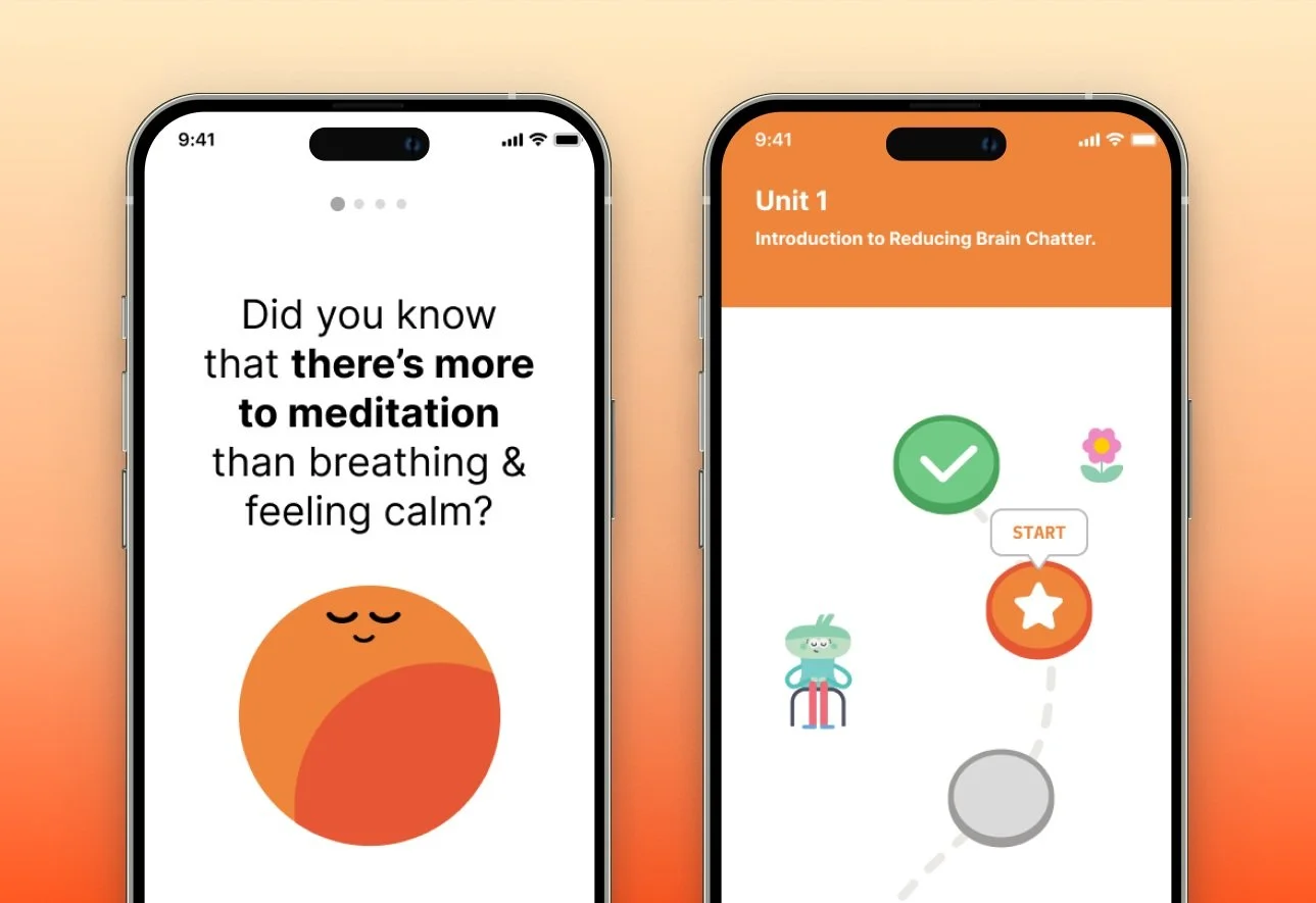
Project 2: Headspace
Adding a Feature.


