Adding a Feature to Headspace
This project is a self-selected design challenge that I worked on as a student at DesignLab.
Why this project? Headspace has helped me reduce my morning anxiety & maintain my meditation practice for 5 years. I wanted to explore how I can improve the app through UX Design.
92% of users stop using the app every month.
PROBLEM
Provide educational content about meditation.
SOLUTION
How did I do it?
1. First, I researched competing apps.
COMPETITIVE ANALYSIS
Method: I looked at the pro’s and con’s of the top meditation app in the market.
Why: To get inspiration for what I should and shouldn’t include in my design.
Results:
Feature Comparison List
Method: I interviewed 5 participants on their experience with the app. Then, I analyzed the interviews using Affinity mapping.
Why: To understand users general experience with the app. Affinity maps help lay out what issues are most prevalent amongst the participants, and thus helping me decide what issue to prioritize.
Results: Top insights:
Users stopped using app because content was too repetitive.
Users initially tried Headspace to destress.
Users did not use ‘Buddy’ feature.
Ui was too overwhelming.
App was too pricy.
2. I interviewed Headspace users.
USER INTERVIEWS
3. I surveyed Headspace users.
SURVEY
Method: I created a short survey and sent it out for people to fill out.
Why: To get more data about user’s experiences with Headspace and find the main issues with it.
Results: 45 responses total.
Users tried Headspace to destress.
Price is too high for users.
Content was too repetitive.
Ui was too overwhelming.
Learning Moment:
What was the mistake? I posted the survey on public forums online.
Why was it a mistake? There were responses where participants clearly did not put in effort, which made results unclear.
What I’ll do better next time: I will only send the survey to people I know have incentive to answer it with effort. This is why in project 3, I chose a focus that most of my acquaintances were knowledgeable about.
SOCIAL LISTENING
4. I read what users were saying online.
Method: I read reviews of the app on the app store, Reddit, and official Headspace Facebook page.
Why: I needed more data to understand the user’s experiences with the app.
Results: Most users stopped using Headspace because they needed a deeper understanding of meditation.
Method: I gathered all of the main points discovered in the interview, survey, and social listening steps. Then, I made a list of the problems, and chose the top three issues to explore further.
Why: To understand what the most prominent issues are throughout the different research methods. I chose to explore three different issues instead of one because there were many options and wanted to see what ideas can be most impactful and effective.
Result: Top problem statements:
Users found the content too repetitive.
Users found a hard time adding ‘Buddies’.
Users found the exercises too shallow & wanted a deeper understanding.
5. I defined the main problem.
DEFINE
Top three problems & why they were chosen:
6. I create an user persona.
USER PERSONA
Method: I created a persona that represents the user’s needs.
Why: User personas are great tools to remember our main goals: that we are designing products for people and their specific needs.
Results: Matthew represents meditators who want to expand their knowledge about the practice.
7. I sketched some ideas.
IDEATION: SKETCH
Method: I sketched out different possible solutions based on the insights discovered in the competitive analysis, surveys, and interviews.
Why: I can quickly layout different ideas, compare them, and pick the best options.
Result: I decided to create a more in depth course about meditation. I’ve come to this solution because from the user interviews I found that users who continue using Headspace had previous, in-depth classes about meditation beforehand.
8. I created the user flow.
IDEATION: USER FLOW
Method: I created an overview of how the user would go through onboarding.
Why: To get a birds-eye view of the experience & rearrange/add/delete anything quickly.
Result:
Onboarding
Journey
9. I created wireframes.
WIREFRAMES
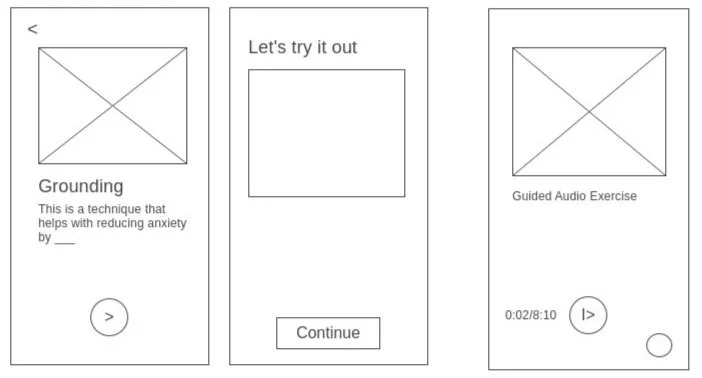
Method: I created wireframes that layout where the basic elements will be placed.
Why: This helps with transitioning from sketch to prototype.
Result:
10. I gathered inspiration & information.
RESEARCH
Method: I read meditation books and magazines at a local book store. I also gathered screenshots of ui designs and Headspace screens in order to construct my screens in the next prototyping step.
Why: Although I have many years of experience meditating, I am not certified to teach it yet. This is why I wanted to make sure that the content that I include is based on trusted sources.
Result: While reading, I found the exact information I needed and also found inspiration on how to visualize this information. Gathering inspirations helped me create great ui designs in the prototyping step.
Content inspiration
Ui Design inspiration board
Headspace Screens for reference
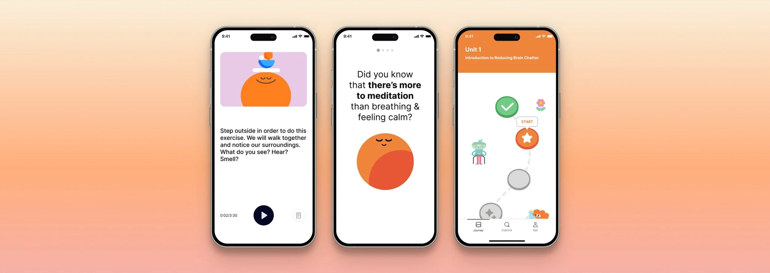
11. I created the 1st prototype.
PROTOTYPE #1
Method: I created my first prototype using Figma.
Why: Prototypes allow me to test my ideas and receive feedback in order to make the user experience better.
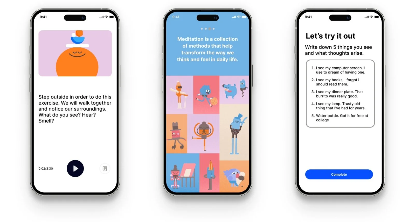
Result:
12. I tested my prototype, got feedback, and improved my design.
Method: I tested my prototype with 6 participants by having them go through the app and think aloud. Then, I improved my designs based on the feedback.
Why: This helps me understand how I can improve my design.
Result: Overall, participants stated that the visuals and text were very easy to follow and they were not too overwhelming. All participants stated that they were more interested in pursuing meditation than they had been prior to this test.
Improvements
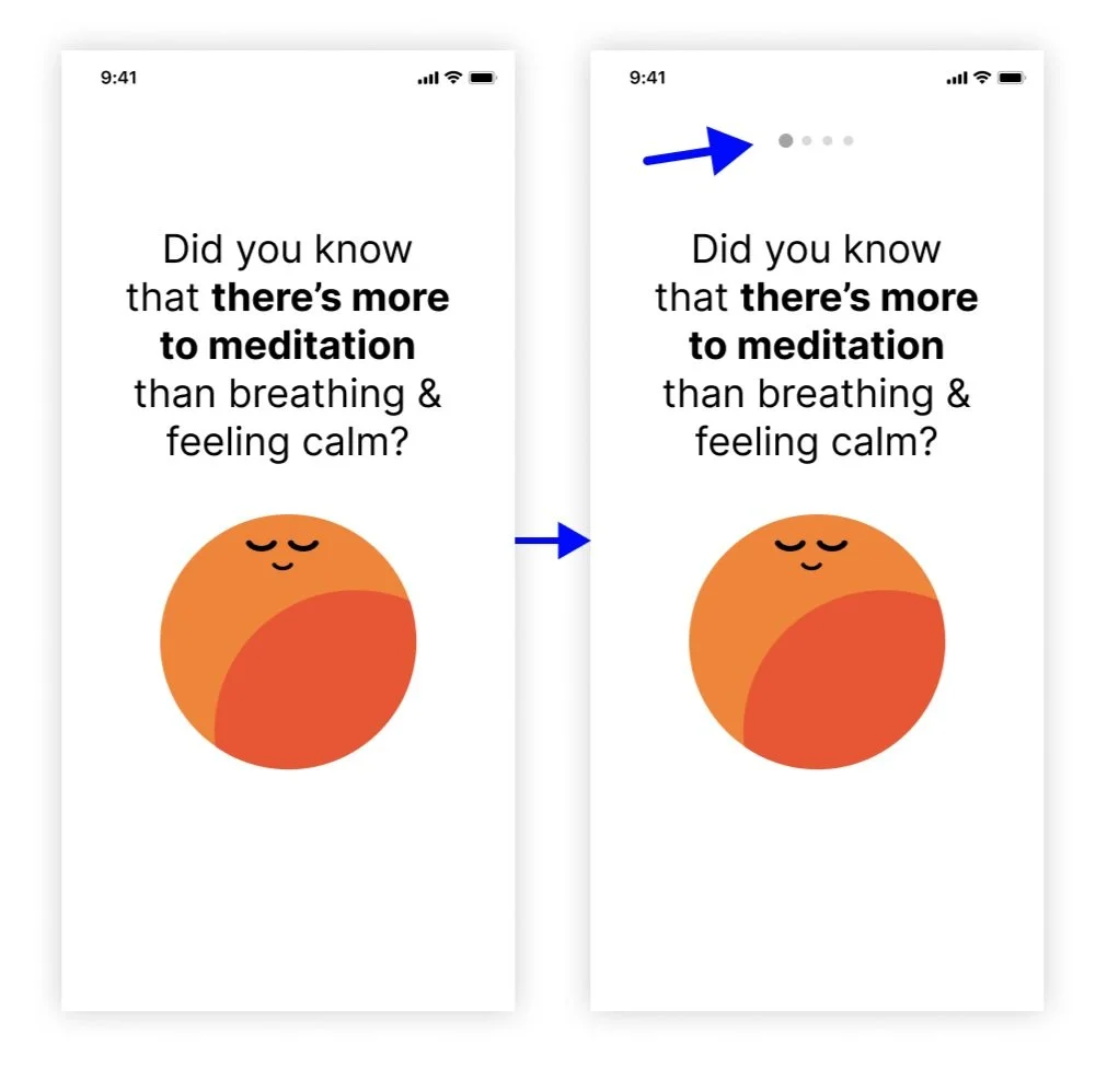
Participants were confused about how to navigate the onboarding screens so I added dots to indicate where they are and that these screens are scrollable.
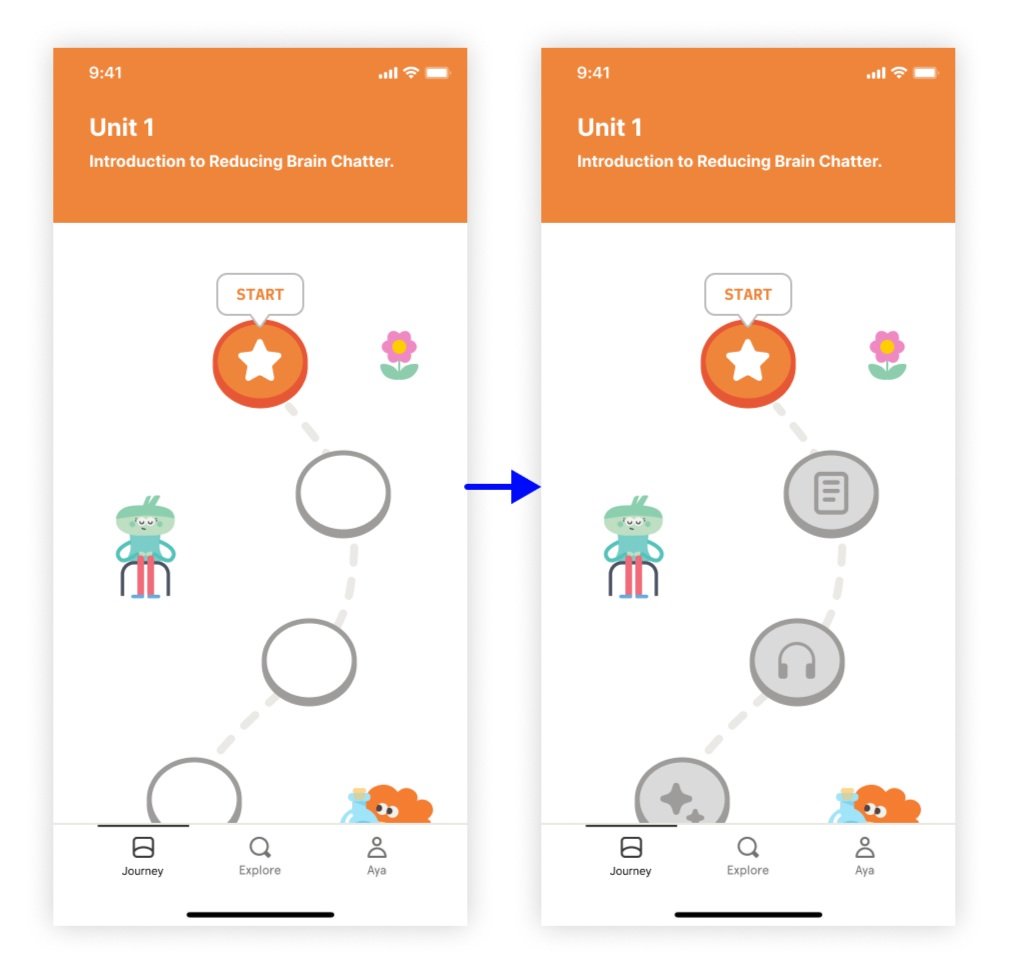
Participants wanted to know more about the upcoming levels. This is why I added simple icons to the circles. I didn’t add text to keep the layout as simple as possible.
Create more example screens of other exercise types.
Test the other exercise types to see which ones users like most.
Ideate feature where users can easily access methods they’ve learned.
Next steps
Check out my next project:
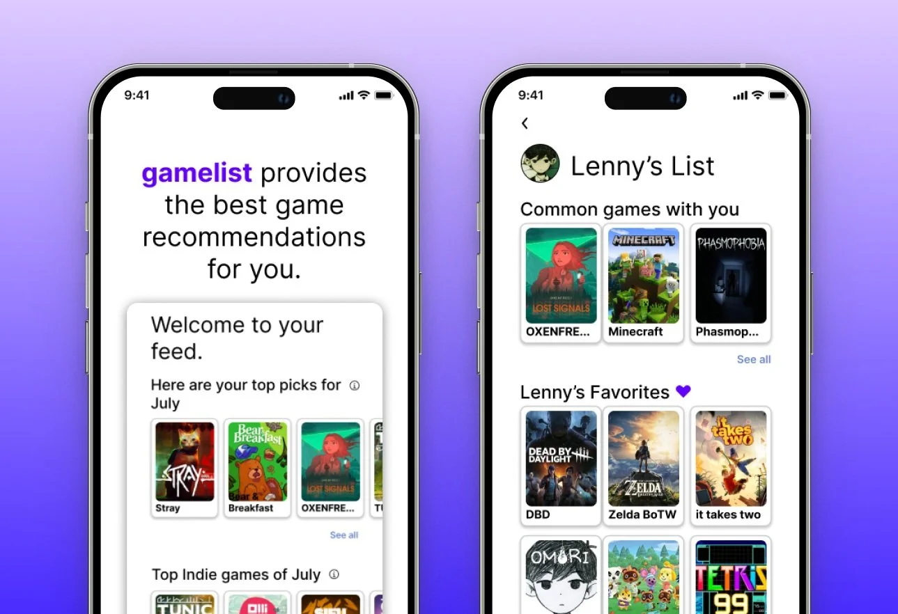
Project 3: Gamelist
End to End App Creation


